Toggle the Button in the AutyFi Scorecard Follow

Understanding the Data View Toggle in the Scorecard Overview
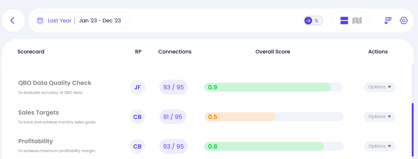
The data view toggle (highlighted in the red box) is a control element that allows you to switch between viewing data in decimal points or percentages. Here’s a breakdown of what this toggle does and when it might be useful:
What is this Toggle Next to the Data View?
This toggle is a feature that allows users to switch between different formats to display data.
It provides two main viewing options:
- Decimal Point View: Displays numerical values as decimals.
- Percentage View: Displays numerical values as percentages, making it easier to understand proportions and changes.
What is the Difference Between the Decimal Point Toggle and the Percentage?
Decimal Point View:
- Values are displayed as raw numbers with decimal precision (e.g.,
0.75). - Useful when precise numerical data is needed for detailed analysis.
- Example: When comparing raw metrics like conversion rates or average scores where exact numbers matter.
Percentage View:

- Values are converted into percentages (e.g.,
75%). - It offers a more intuitive understanding of data by showing it as a whole.
- Example: When presenting data to stakeholders who prefer an overview of how much of a target has been achieved.
Scenarios in Which the Toggle Could Be Useful for Different Reports:
Using Decimal Point View:
- Ideal for internal analysis and deeper insights where precision is key.
- Example: Comparing the exact conversion rates across various channels to identify slight differences in performance.
- It is useful when small variations in data can impact decision-making, such as in financial forecasting or detailed statistical analysis.
Using Percentage View:
- It is best for creating presentations or reports where you want to convey data more clearly to a broader audience.
- Example: Showing the overall growth of sales in percentage form to give a quick overview of progress.
- Helpful for highlighting trends and making comparisons over time (e.g., increase in email campaign open rates).
The toggle next to the data view allows flexibility in viewing and presenting your data, catering to detailed analysis needs and high-level summaries. When sharing insights with others, use the Decimal Point view for precision and the Percentage view for clarity and ease of understanding.
Comments
0 comments
Article is closed for comments.